.png)
.png)

Domino's Pizza Website Redesign
This project aims to improve Domino's online presence by redesigning its website to enhance the customer ordering experience, focusing on key elements such as menu visibility, order efficiency, and the visibility of coupons. The current design of the Domino's Pizza application has low retention rates and is confusing to customers.
By redesigning the website with the customer in mind, the project goal is to improve both business and website retention.
Project
Self-initiated
My Role
UX Researcher
UX Designer
Timeline
2 weeks (2023)
Tools Used
Adobe XD, Photoshop, Canva
Design Process

Initial Thinking
Target Users
-
College students needing affordable, quick meals.
-
Busy professionals with demanding schedules.
-
Families looking for easy dinner solutions.
Research Methods
-
Existing system
-
Quantitative research (survey)
-
Qualitative research (in-person interviews)
Research Insights
Survey Findings 45 Respondents
61.1%
ordered their pizza from Domino's versus other chains
83.3%
primarily looked at price when determining their order
89.5%
wanted to spend 10 minutes or less to place an order
72.3%
would change their order if a deal/coupon was available
Interview Insights
6 Interviews
"can't tell where I'm supposed to look"
"The site feels cluttered, making it tough to focus on what I need.
"There are so many ads that ordering feels secondary."
"The layout is scattered, making it hard to navigate."

"Each page has too much going on—it’s overwhelming."
"There are so many buttons that it’s hard to know where to start."
Challenge
Problem Statement
How might we identify the needs of users and establish an effective system that promotes seamless navigation and ordering, addressing the current challenges of a cluttered and overwhelming design?
Persona - Busy Student

Sandra
Art Student
22 Years Old
Aspiration
"Between classes and projects, I need a fast and stress-free way to order food that fits my budget."
Frustration
Has difficulties in her schedule making time to cook and meal prep.
Would refuse to order food due to bad layout design or overwhelming designs
Most healthy options are too expensive

Jackson
Retired Engineer
58 Years Old
Aspiration
"I need something quick and easy to feed my kids during busy afternoons, without spending too much time navigating a confusing website."
Frustration
Doesn't always have time to cook
Can’t leave children alone to go pick up food
Children are picky eaters
Can’t always find deals he wants for large quanitities of food
Can’t always figure out how to navigate complicated delivery websites
Persona - Stay at Home Dad
Prototyping and Testing

User Testing Insights and Actions
01
The landing page overwhelmed users
Display coupons/deals icons in the menu when ordering to decrease clutter on the landing page.

02
People care about order efficiency
Add drop-down menus to items to increase efficiency when ordering.
03
The menu is first thing most people want to see
Move the Menu icon near the order button for more prominence.
Visual Identity
Helvetica Neue
Aa
Helvetica Light
#E51A36
#0b648f

Prototype
01
Original

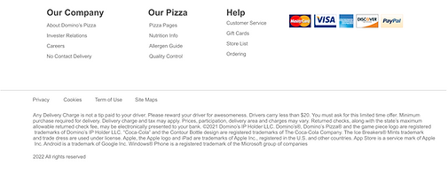
Pain Point: The landing page overwhelmed users
*Some on-screen text is too small, making it incompatible with ADA accessibility standards and difficult to navigate with screen readers.
Re-Design


Pain Point: The landing page overwhelmed users
-
Audited the site for ADA compliance and identified accessibility issues, such as small text sizes and poor screen reader compatibility.
-
Reorganized the coupons tab to appear directly under the menu for quicker access to deals.
-
Simplified the site’s navigation by reorganizing the menu structure for faster access to key features, such as "See Menu."
-
Reduced visual clutter by categorizing information and using whitespace effectively.
-
Included an interactive map to help users easily find the nearest Domino's location.
-
Added a "How It Works" section to guide first-time users through the ordering process in an accessible and intuitive way.
02
Original

Pain Points
-
Users struggle to locate key features because many options are hidden behind dropdown menus, leading to confusion and frustration.
-
Once a dropdown menu item is selected, all other menu options disappear, making it hard for users to explore without retracing their steps.
-
The need to repeatedly go backward to access other menu items interrupts the user’s navigation flow and creates a frustrating experience.
Re-Design


Pain Point: The landing page overwhelmed users
-
Reorganized items into tabs, ensuring that all options remain visible while users interact with a specific selection, improving navigation and reducing frustration.
-
Expanded the number of available options to give users more choices and flexibility when ordering.
-
Enabled users to customize every pizza easily, allowing for a more personalized experience.
* Full wireframe available upon request
Prototype Gallery


Takeaways
This project was my first experience working on a web-based UX/UI and UXR design, and it was both challenging and rewarding. Redesigning Domino’s website taught me how to balance user needs with preserving key brand features, while working within the constraints of an established system.
I gained valuable skills in creating accessible, user-friendly designs for diverse audiences. If given more time, I would focus on consolidating similar features and simplifying the user flow to enhance navigation. This project deepened my understanding of web-based user experiences and strengthened my adaptability as a designer.
